


Choosing a practitioner is not necessarily an easy task for families of those who need the services of people receiving NDIS benefits. This process is based on trust that should have been established long before. This process begins by visiting the website of a provider. One of the effective tools for establishing trust at the early stages is a Google Map that displays the areas in which the service is being offered by the provider.
The Trust Challenge NDIS Providers Encounter
Given that over 21,000 NDIS providers are actively operational right now, customers have a plethora of options and choices available to them. Whenever customers arrive on the website, they generally have themselves three basic questions.
1. Do you service my region?
2. Are you a legitimate, trustworthy provider or just a name on paper?
3. Is it easy or hard to work with you?
Thus, something as vague as “providing services in Greater Sydney” does not help in answering any of the discussed questions. A good map should do the job. This is just one of the potential problems affecting effective lead generation and conversion on NDIS websites.
What a Service Area Map Actually Represents
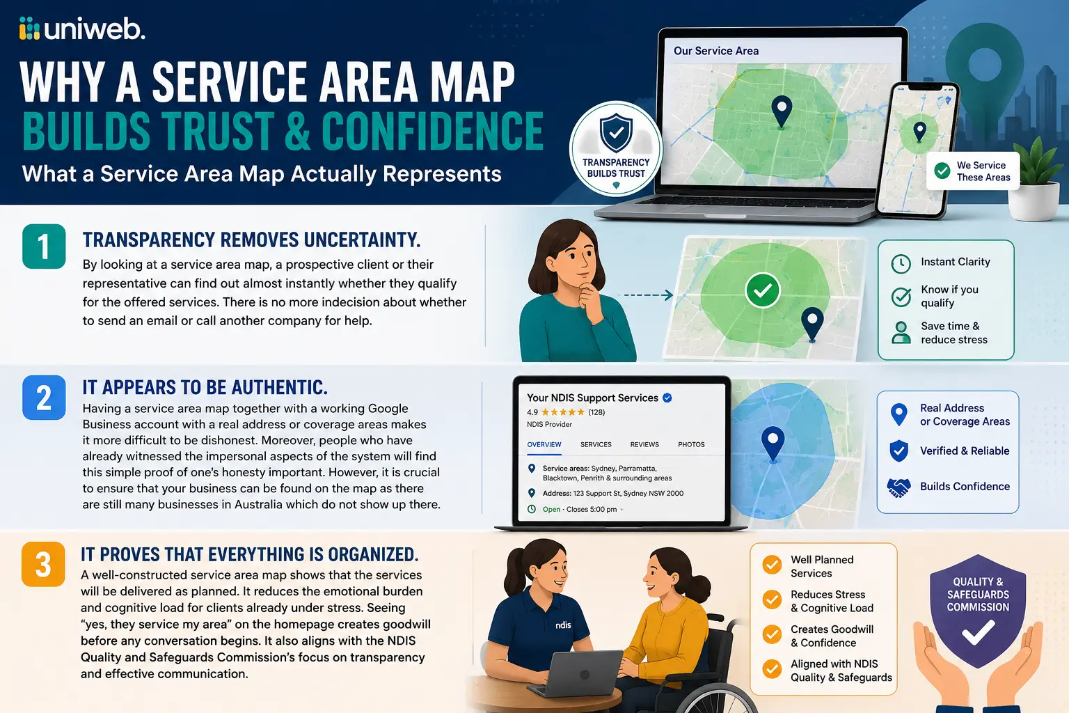
1. Transparency removes uncertainty. By looking at a service area map, a prospective client or their representative can find out almost instantly whether they qualify for the offered services. There is no more indecision about whether to send an email or call another company for help.
2. It appears to be authentic. There are different ways to present one’s business as “local.” But having a service area map together with a working Google Business account with a real address or coverage areas makes it more difficult to be dishonest. Moreover, people who have already witnessed the impersonal aspects of the system will find this simple proof of one’s honesty important. However, it is crucial to ensure that your business can be found on the map as there are still many businesses in Australia which do not show up there.
3. It proves that everything is organized. The services of NDIS are typically carried out by a support coordinator or plan manager who will have to work with several service providers at the same time. Therefore, a well-constructed service area map indicates that the services will be delivered as planned.4. The emotional burden is reduced. Many people visit an NDIS provider’s website while they are already under stress due to a diagnosis, a plan review, or a crisis. Therefore, any effort that reduces cognitive load, such as seeing on the homepage “yes, they service my area,” is a small favor that generates goodwill before any discussion begins. Moreover, the NDIS Quality and Safeguards Commission also wishes providers to communicate effectively and transparently and thus the intuitive map fits well into the overall context.
Ways NDIS Providers Can Put This Into Practice
Providers do not always require the same kinds of maps, and several options to consider include:
• Maps showing your coverage area — Whether shaded areas or pins displaying suburbs, maps showing your area of operation are crucial for providers covering multiple LGAs or areas where “we service Sydney” may convey any message.
• Maps of your office and hub locations — If you operate a physical location for meetings, group programs, and drop-in support, a pin-down address and a button for directions would be a simple way for a potential visitor to reach you.
• Maps specific to your services — In some cases, multiple services are offered by providers in different locations. A filterable map would make it easier to find your services compared to using some long paragraph about every area serviced.
• A map tied to your verified listing — using maps on your site that match your Google Business Profile will send the same signal to two sources simultaneously: your site and Google results.
Common Mistakes That Undermine Trust
A poorly-made map can be just as damaging for credibility as a well-made map can be helpful. Here are some common problems:
– Obsolete coverage. A provider that has made additions (or reductions) in coverage without updating the map can come across as negligent when a family is trying to decide whether they can be trusted.
– Lack of any supportive context. A bare embed without any explanation will leave visitors clueless as to what the shaded areas or pins represent.
– Maps that take too long to load. A large unoptimized map that makes the page slow has the opposite effect of the professionalism portrayed by the map, especially on mobile, where many service recipients are looking for information.
– Design that cannot be accessed by everyone. If a map can be understood only through colors or hover states, it is unsuitable for a sector where access is the main issue.
✅ A Simple Checklist Before You Publish
- ✓ Map reflects your actual current service areas, not aspirational ones
- ✓ Pins or shading are clearly labelled (suburb, LGA, or region names)
- ✓ Map is placed somewhere visible — homepage or contact page, not buried in a submenu
- ✓ Map loads quickly and doesn’t slow down the page on mobile
- ✓ A short line of plain-English text sits next to the map explaining what it shows
- ✓ Map is consistent with your Google Business Profile listing
- ✓ There’s a clear next step (contact form, phone number, “check if we cover you” prompt) right next to the map
Why This Matters More for NDIS Than Most Industries
The majority of organizations lose their clientele to their competitors due to issues related to pricing or preferences. However, NDIS providers are unique in that the individual who makes the decision is likely going through a tough time — a new diagnosis, an emergency review of their plan, or a search prompted because their previous service provider turned out to be untrustworthy. It makes that every inconvenience avoided and every enlightening moment experienced significantly influences whether a person chooses to reach out or just closes the web page. A map of the service area is part of the process; nevertheless, it is a relatively simple thing to get done.
A Practical Comment on Implementation
To ensure the efficacy of the map, it must first be user friendly.
– It must be loaded fast and not hinder the performance of your page speed — something that also affects your broader search engine optimisation performance, not just user experience.
– It must also be mobile-optimized since many users are likely to browse with their mobile devices.
– It should be used with a brief and clear description and not be the only useful piece of information, as the communication “We provide in-home services within the zones covered by the map” is much more informative than the map itself.
– f your website is on reliable hosting and properly maintained, embeds like this are far less likely to break or slow the page down after plugin or theme updates.
A map of service areas will not take the place of actual care, competent personnel, or a good reputation — it shouldn’t have to. But it eliminates one of the first and smallest obstacles a participant must overcome before getting in touch. In an industry where trust is the only currency, every small win related to clarity is important. Thanks to AI technologies, implementing such improvements is no longer as hard as it used to be and requires less investment for service providers than before, without the need to completely renovate the website.
To get all necessary and accurate information, registered providers should visit the official website of NDIS.Why This Matters More for NDIS Than Most Industries
The majority of organizations lose their clientele to their competitors due to issues related to pricing or preferences. However, NDIS providers are unique in that the individual who makes the decision is likely going through a tough time — a new diagnosis, an emergency review of their plan, or a search prompted because their previous service provider turned out to be untrustworthy. It makes that every inconvenience avoided and every enlightening moment experienced significantly influences whether a person chooses to reach out or just closes the web page. A map of the service area is part of the process; nevertheless, it is a relatively simple thing to get done.
Does Your NDIS Website Show Where You Actually Service?
Uniweb builds accessible, WCAG-compliant WordPress websites for Australian NDIS providers — complete with clear service area maps that build participant trust and turn visits into enquiries.
Request a Free Service Area Map Review →No obligation · Australian team · Fast turnaround
Frequently Asked Questions
