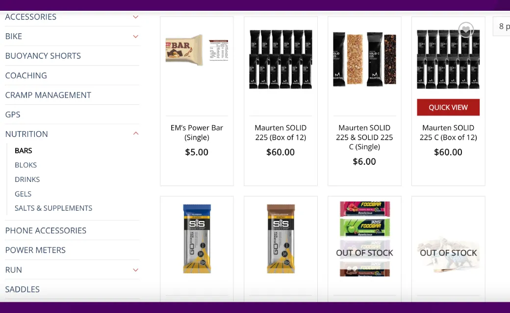
In today’s day and age, online stores have become an integral part of our lives. The race to grab the next customer is intense among all online retailers and the competition in the e-commerce space has increased significantly. Therefore, if you want your WooCommerce store to succeed online, the entire store and most specifically your product page needs to be designed properly to engage and retain customers.
In this article I will discuss in detail the do’s and don’ts while designing e-commerce product pages using WooCommerce on WordPress.
DO: Simplify your Layout
The layout of your product page is extremely important to your user experience is understanding the product they want to buy and moving further in the sales. Keep your product page layout as clear and simple as you can with the right information easily available. A simplified layout makes it easier for customers to browse the product page and get to the information they need. Universal fonts, high quality images, and a consistent colour pattern are equally important.

DON’T: Get rid of unwanted information
While it’s very important to give your customers all the info they need about your product, avoid overloading your page with too much text or pictures . This can confuse your customers and make it difficult for them to find what they’re looking for. Instead, use bullet points to showcase the main features of your product and keep your product descriptions short and sweet.
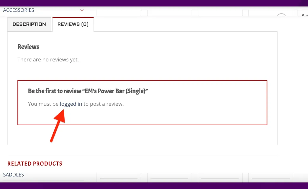
DO: Include Customer Reviews ( even negative ones)
A recent survey conducted online among online shoppers in Sydney conncluded that a customer is 69% more likely to buy a product with a 5 star review then one with 3 or less star or no review at all. Customer reviews and ratings can be a great way to earn your customers’ trust. Adding favorable reviews and ratings to your product page can boost the chances of a customer deciding to buy. Remember to handle any negative reviews politely and professionally, demonstrating your appreciation for customer feedback.
DON’T: Use Fake Reviews
While the temptation might be there to have your friends or family member quickly get on your store and leave glaring 5 star reviews, do not get into this. Employing fake reviews or ratings is not honest and can destroy your reputation. Customers are getting better at spotting fake reviews, and they tend to trust products more when they see a mix of both positive and negative feedback. Encourage your customers to share their genuine reviews, and use them as valuable insights to enhance your product or service
DO: Responsive Product Page
As the trend suggest, 3 out of 4 sales on your online store would be done on a mobile phone, as more and more people shop online using their mobile gadgets, having a mobile-friendly product page becomes super important. A mobile-friendly page is like a breeze to use and doesn’t keep your customers waiting when they’re on their phones. Make sure to use responsive design, so your page looks just right on various screen sizes.
DON’T: Ignore the Desktop Version
While it’s crucial to have a user-friendly mobile page, don’t forget about the desktop experience. Many customers still prefer shopping on their desktop computers, and if your desktop page isn’t well-designed, it could push them away. Ensure that your page is optimized to cater to desktop users too.
DO: Employ Call-to-Action Buttons
Call-to-action buttons play a vital role in helping your customers make a purchase. Keep your button text simple and straightforward, like “Buy Now” or “Add to Cart.” Ensure they’re easy to spot and grab attention on your page.
DON’T: Avoid Confusing Text
When your call-to-action buttons use unclear or use confusing language, it can leave customers feeling confused and increase your store bounce rate. Stay away from vague phrases like “Learn More” or “Click Here.” Instead, go for clear and straightforward wording that tells customers exactly what they’re doing, like “Buy Now” or “Add to Cart.
Conclusion:
Succeeding at online sales is very competitive these days but you can give your online store a decent chance by following the do’s and don’ts outlined in this article. Make sure your online store is built with user experience in mind that is cross device compatible, easy to navigate and provides all relevant information to your customer at the right stages of the process to enhance the sales process.
If you are looking for a local web design team that specialises in WooCommerce online stores , then you could definitely use the expertise of our dedicated WordPress development team here at Uniweb. We are passionate about what we do and we know what it takes for businesses to succeed online. Call us today for more information about our E-commerce WordPress development services.
